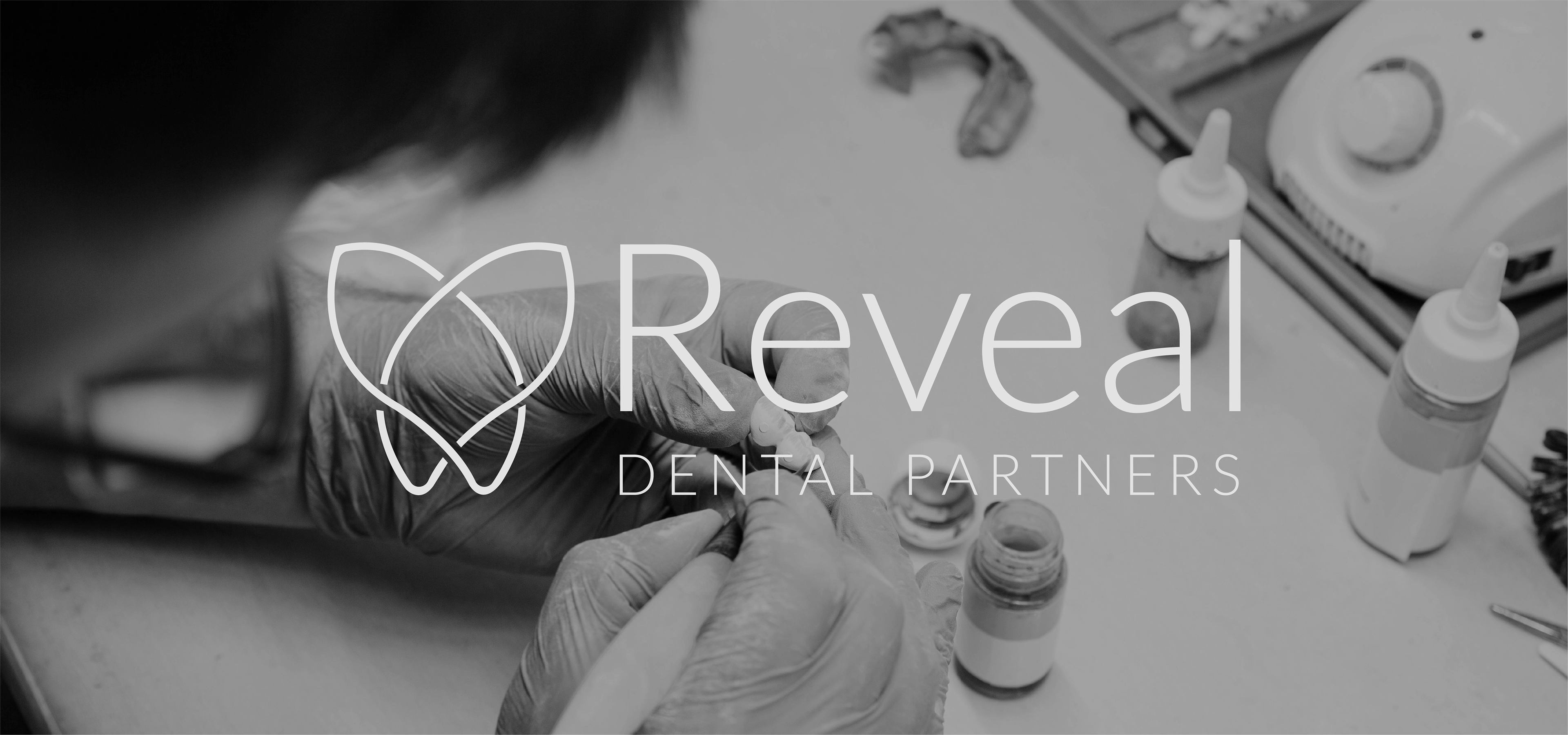
Reveal Dental Partners is an innovative specialty dental network (SDN) designed to scale thriving dental practices through substantial growth by providing patients greater access to high-quality implant treatment. Empowered with clinical autonomy, their expert doctors artfully tailor the services to each patient's unique needs.
Core Values: Innovation / High-Quality Care / Clinical Autonomy
In this project I received a brand's logo and was required to create the rest of the branding including typography, color palette, additional graphic elements, and stylistic features of brand's imagery.
LOGO & COLORS

The logo is elegant, minimal, and modern carrying that luxurious feel of the brand. The symbol of the brand consists of 2 smooth shapes that combine into a depiction of tooth. Based on the logo, the color palette was created. Using 4 primary and 4 secondary colors. To add range, 2 linear gradients were added as well.

Primary Colors

Secondary Colors

Main Gradient

Secondary Gradient
TYPOGRAPHY
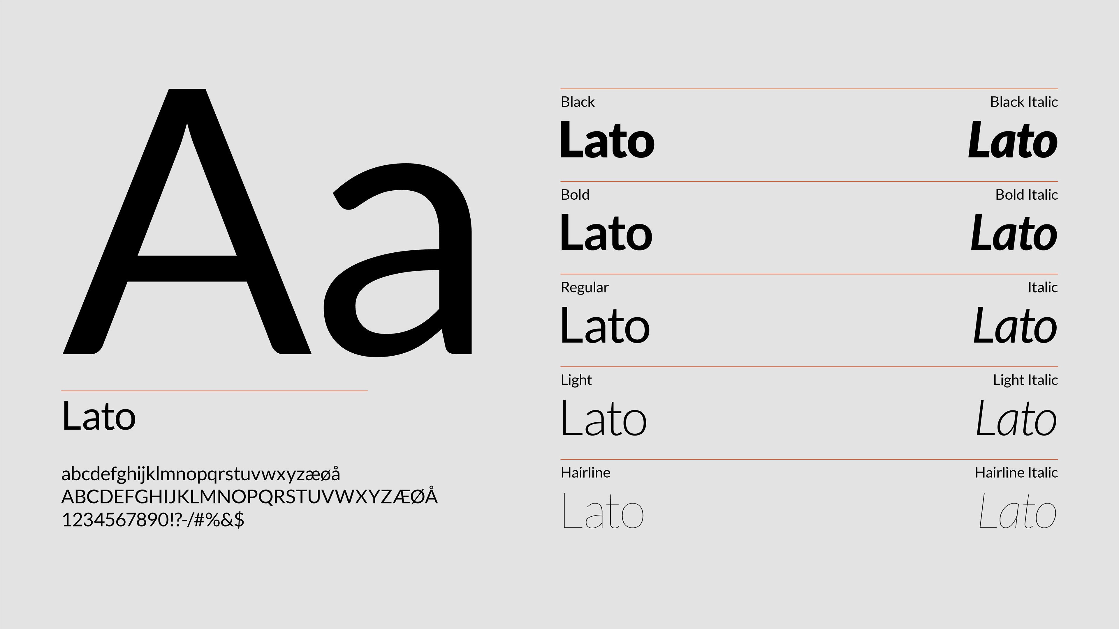
Again for the base I took Reveal's logo which uses Lato Regular font for the text portion. It has a good range of widths and the text stays legible at any of them. At the same time it has a little sophistication which makes this font perfect for luxurious dental brand.
GRAPHIC ELEMENT
Supportive branding element is taken from logo’s submark, and creates consistency of the company’s look for the clients. It’s simple and unobtrusive, needs to be used in the bottom corners of the designs on either side depending on the overall composition. As additional option, there is a variation of the same element at 25% opacity as sometimes it may overlap with other design elements. When so, the semi-transparent version is used.

Peek-a-boo Icon as Graphic Element
IMAGERY
For most of brand's images we decided to se black & white photography to maintain a consistent, sophisticated look that aligns with the brand’s aesthetic. It would help portray the practice as professional, clean, and at the same time stylish. Combined with brand's color palette, such imagery would go well together.
Selective Color Use: Some color images can be added for specific purposes, such as highlighting key products, features, or campaigns. This can provide a pop of color and draw attention without overwhelming the brand's overall visual identity. Additionally, using color for social media can help create a more vibrant and engaging presence, drawing attention and encouraging interaction with the audience.


MOCKUPS
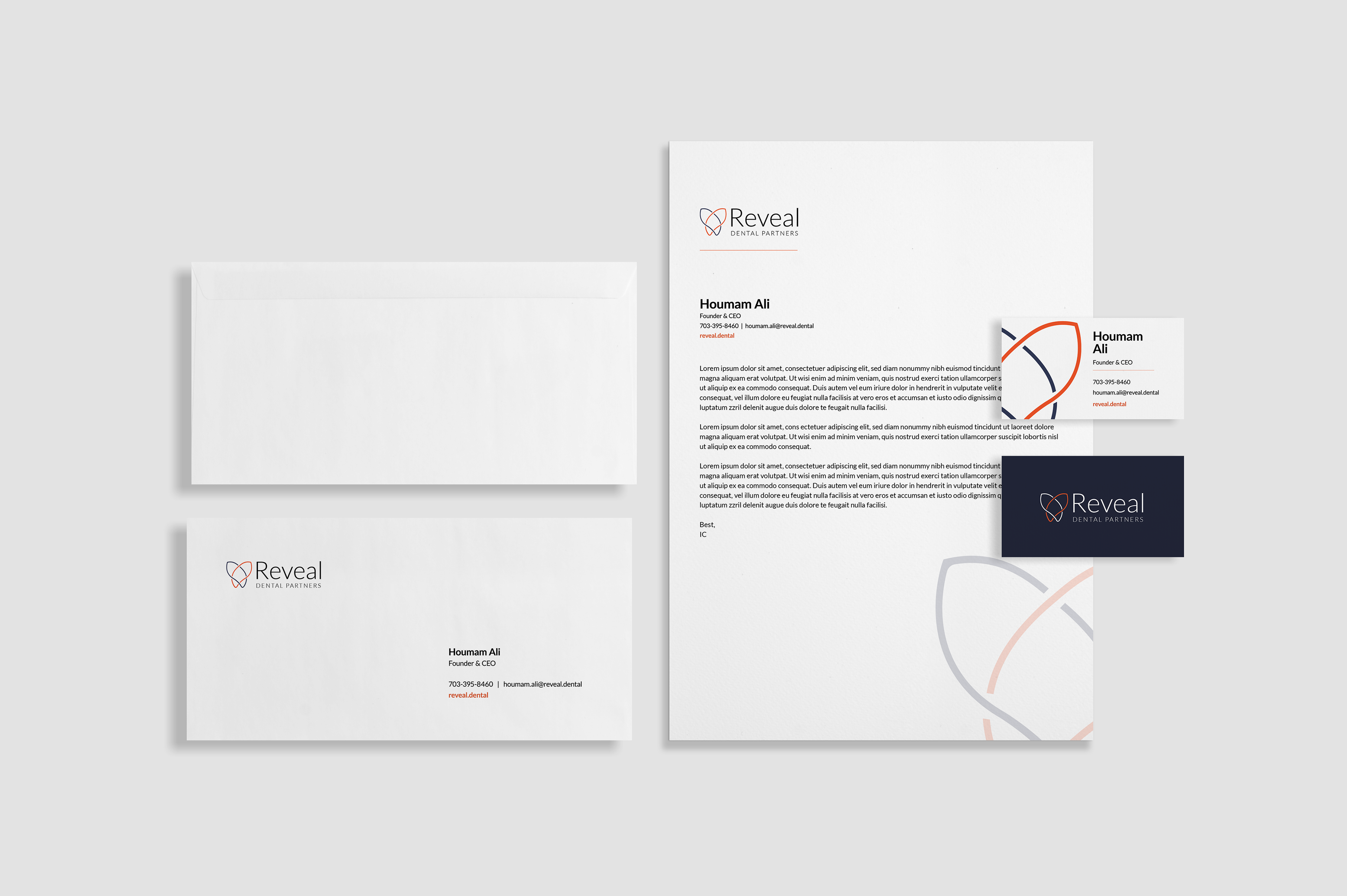
Stationary
2 Sided Brochure

Greeting Card
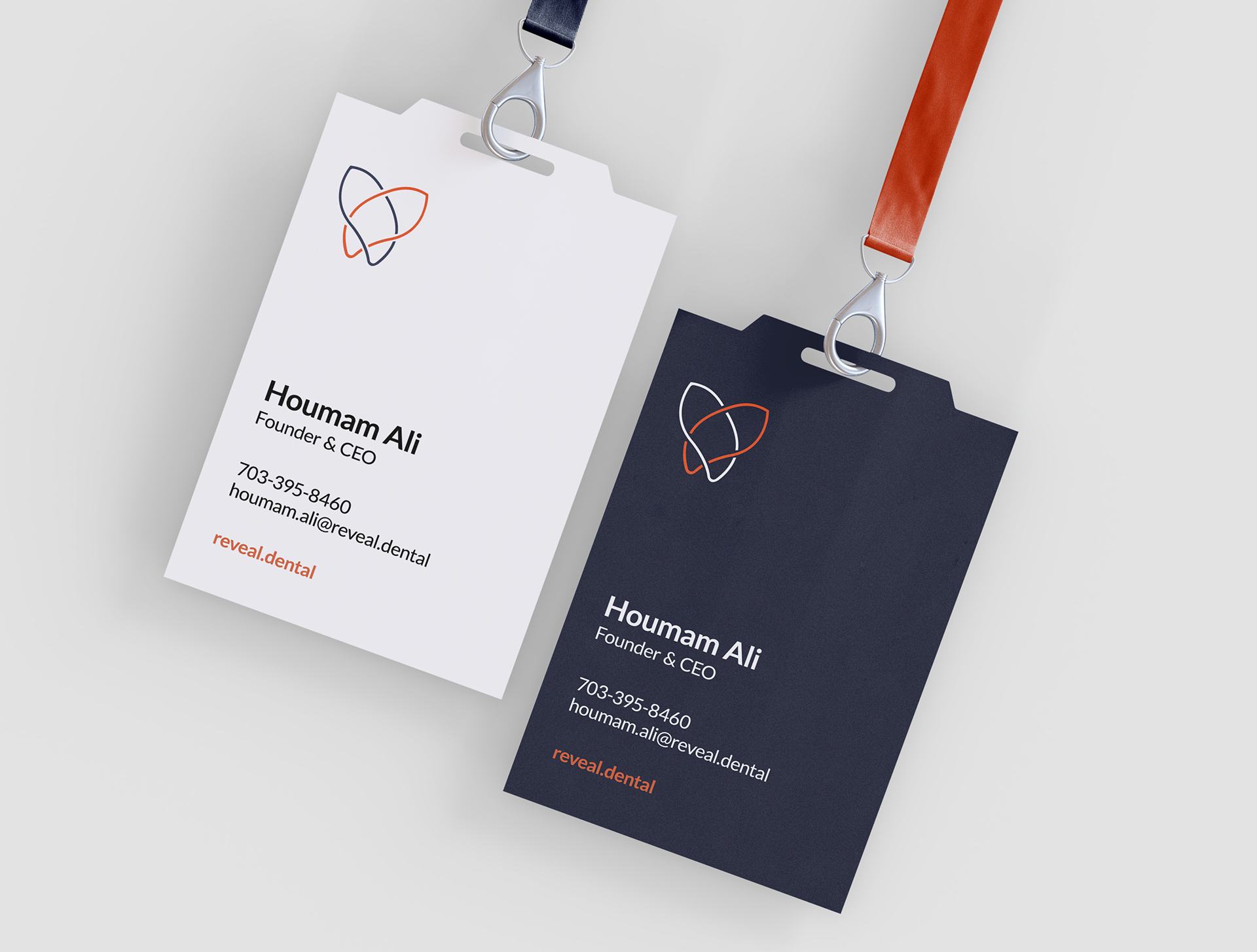
Cards
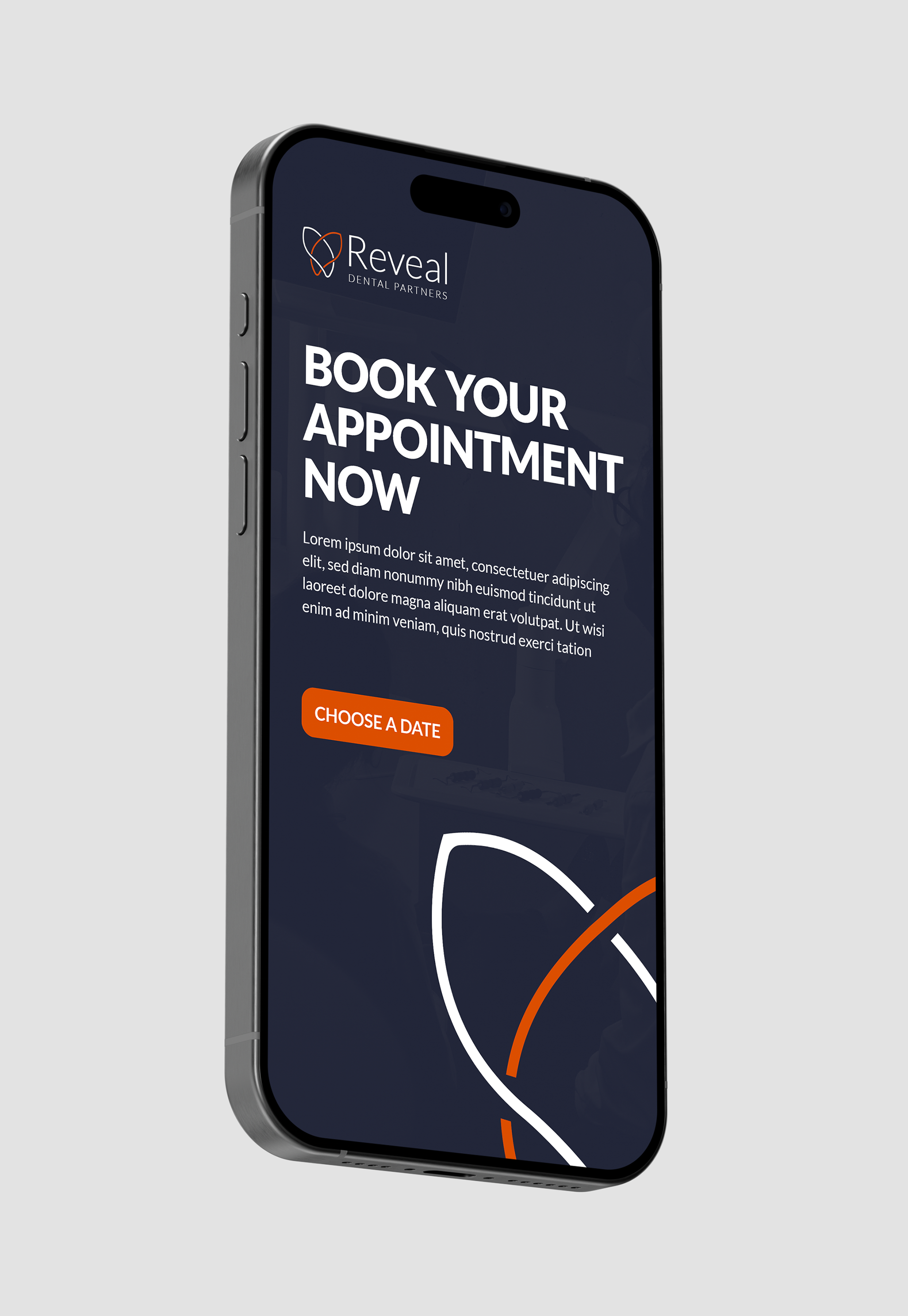
Phone App
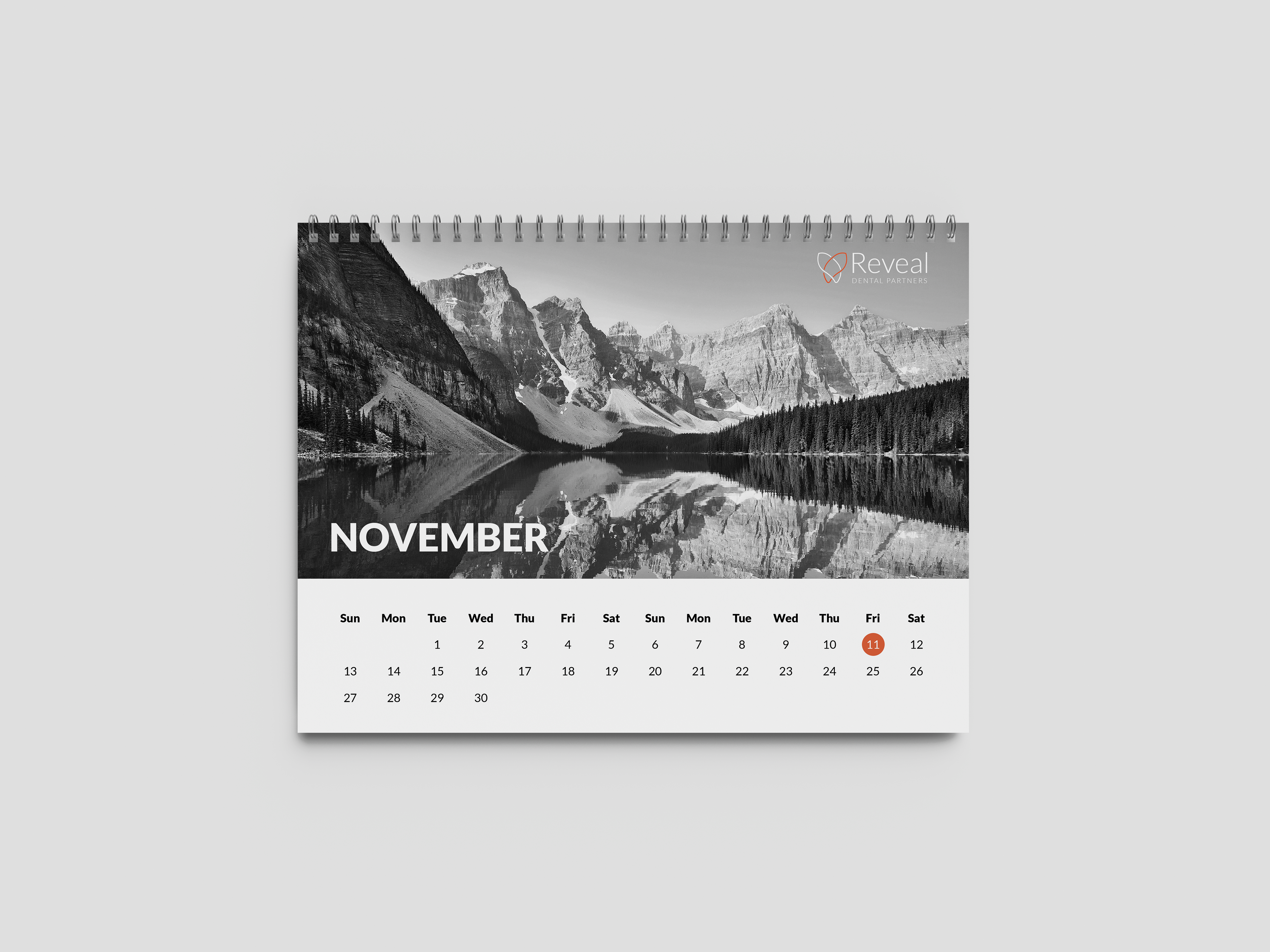
Calendar

Notebook
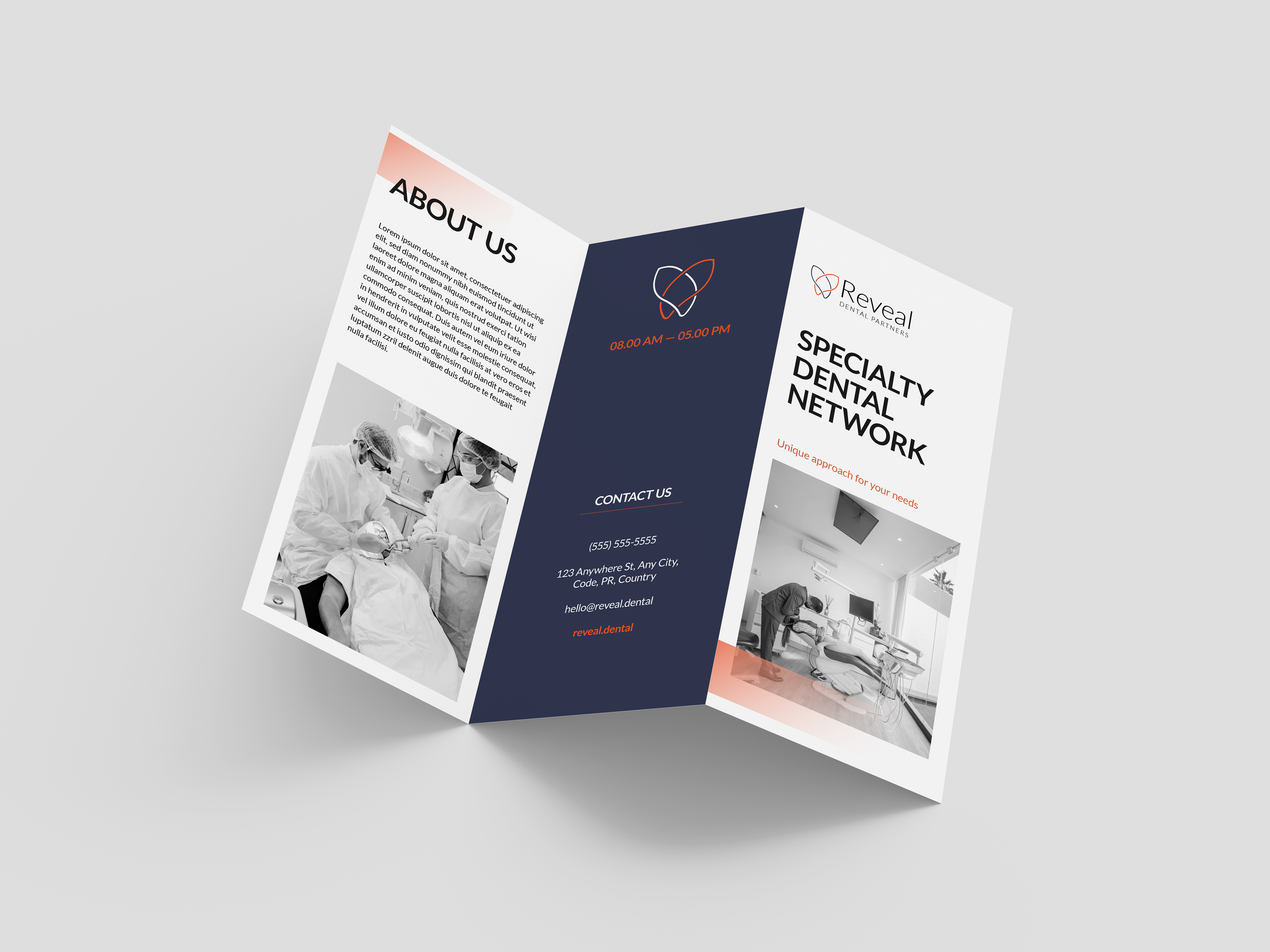
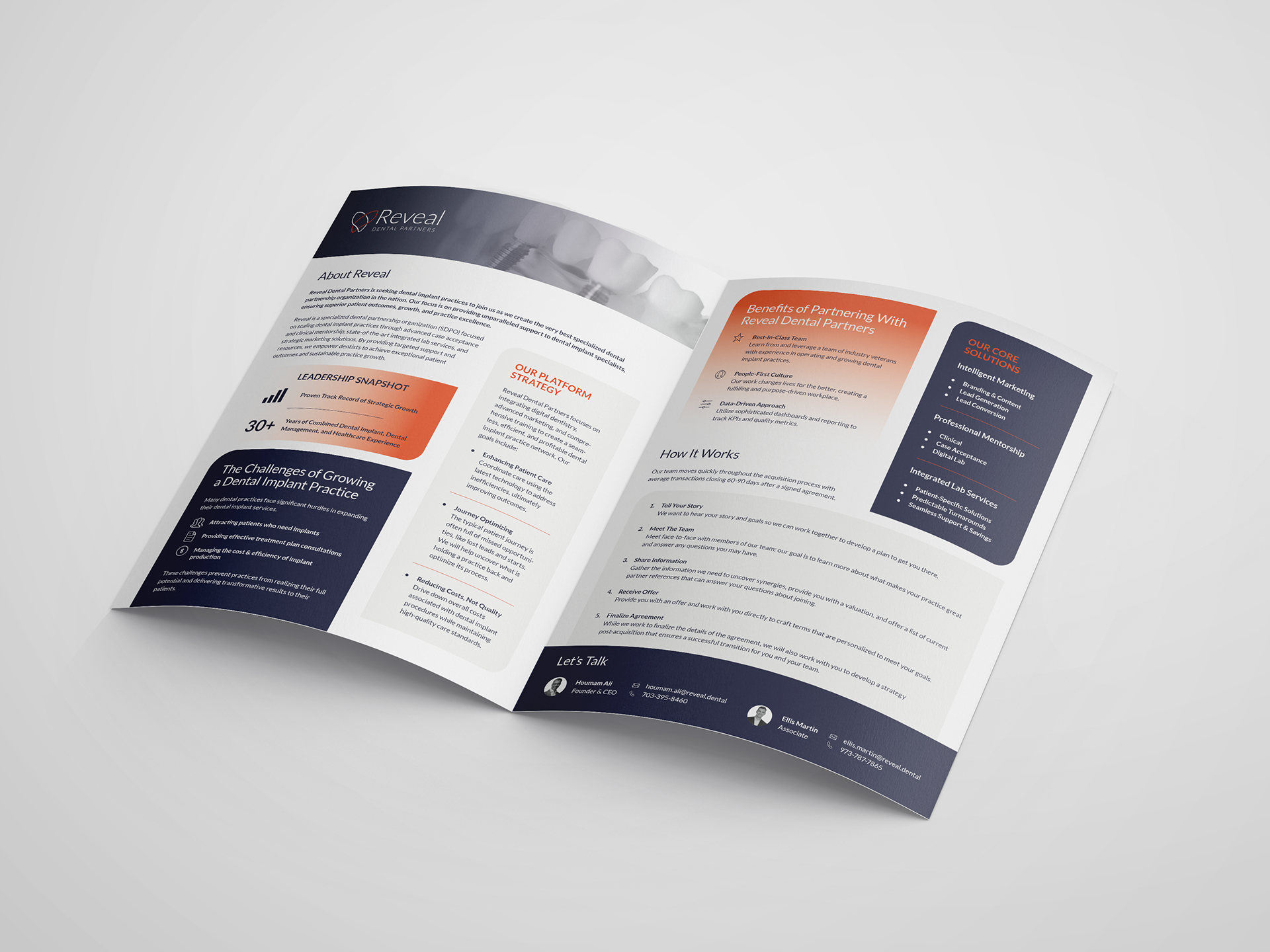
Tri-Fold Brochure
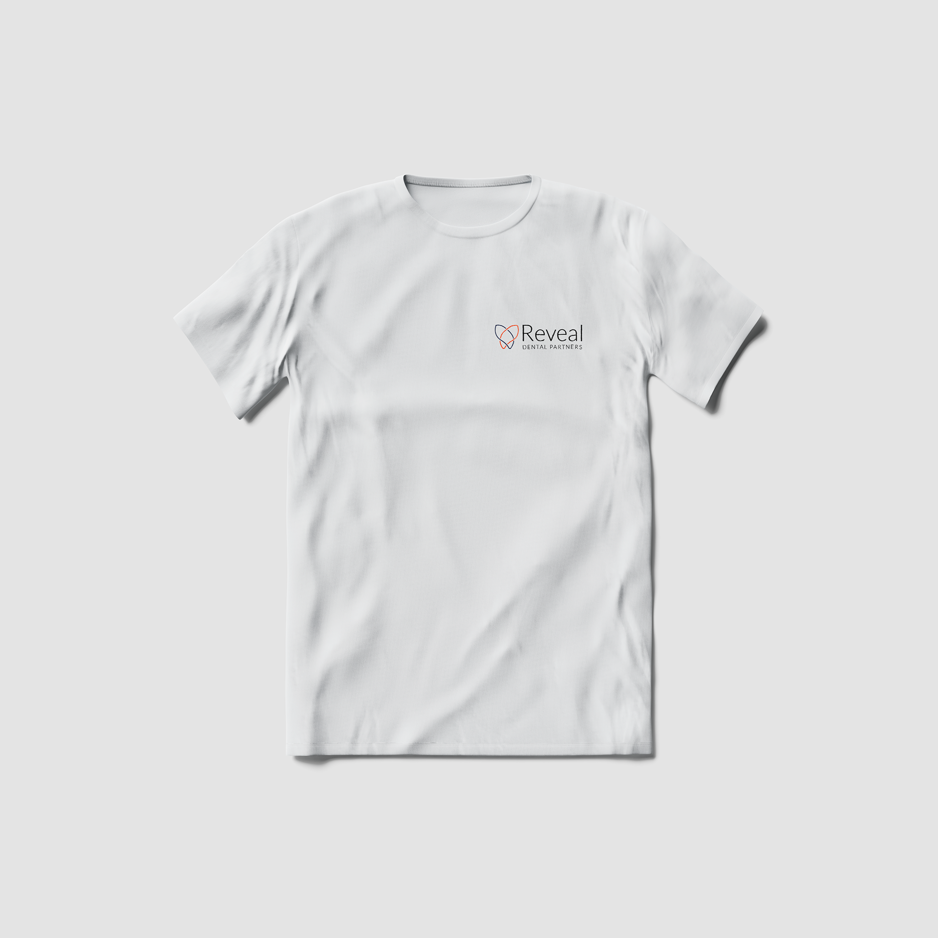
White T-Shirt
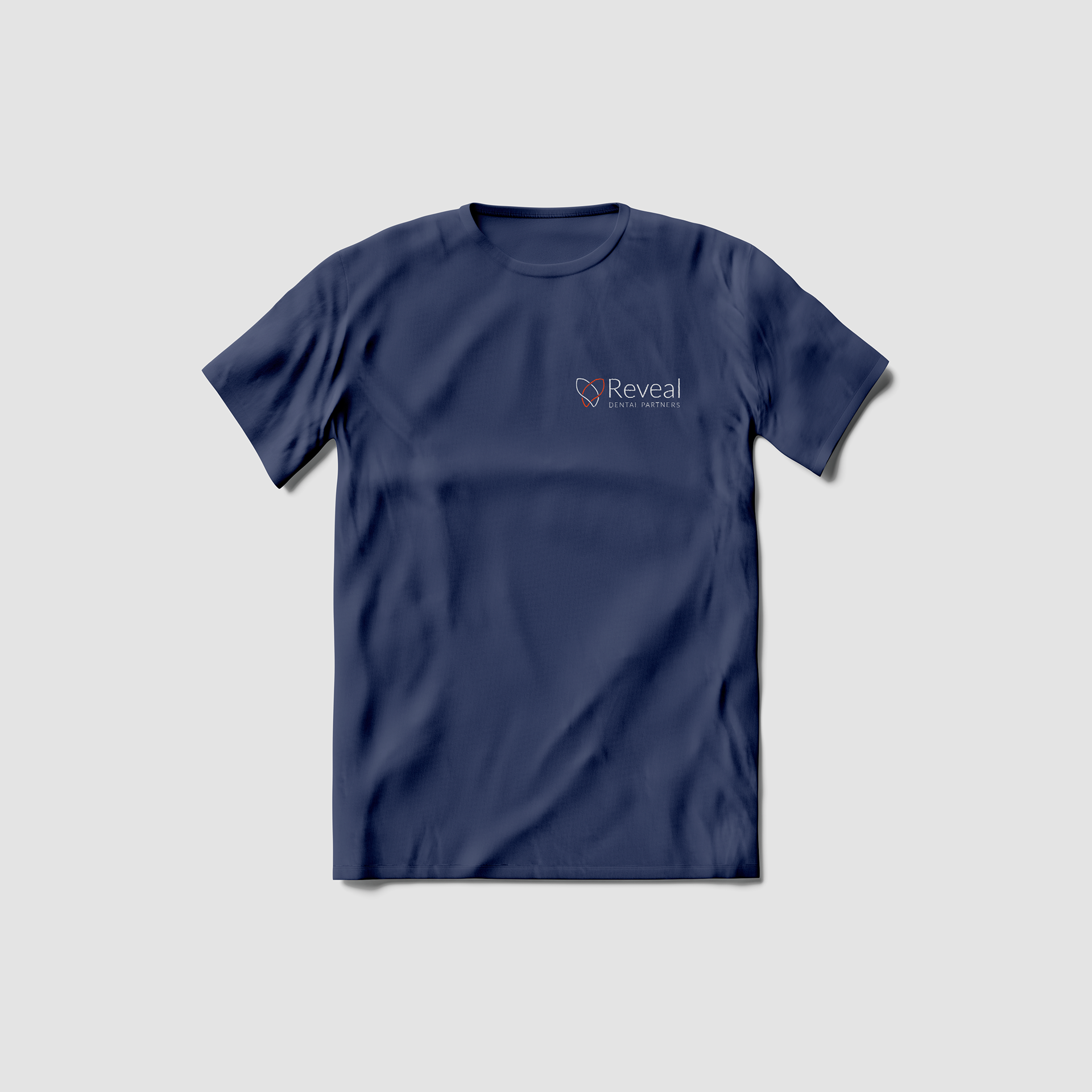
Blue T-Shirt
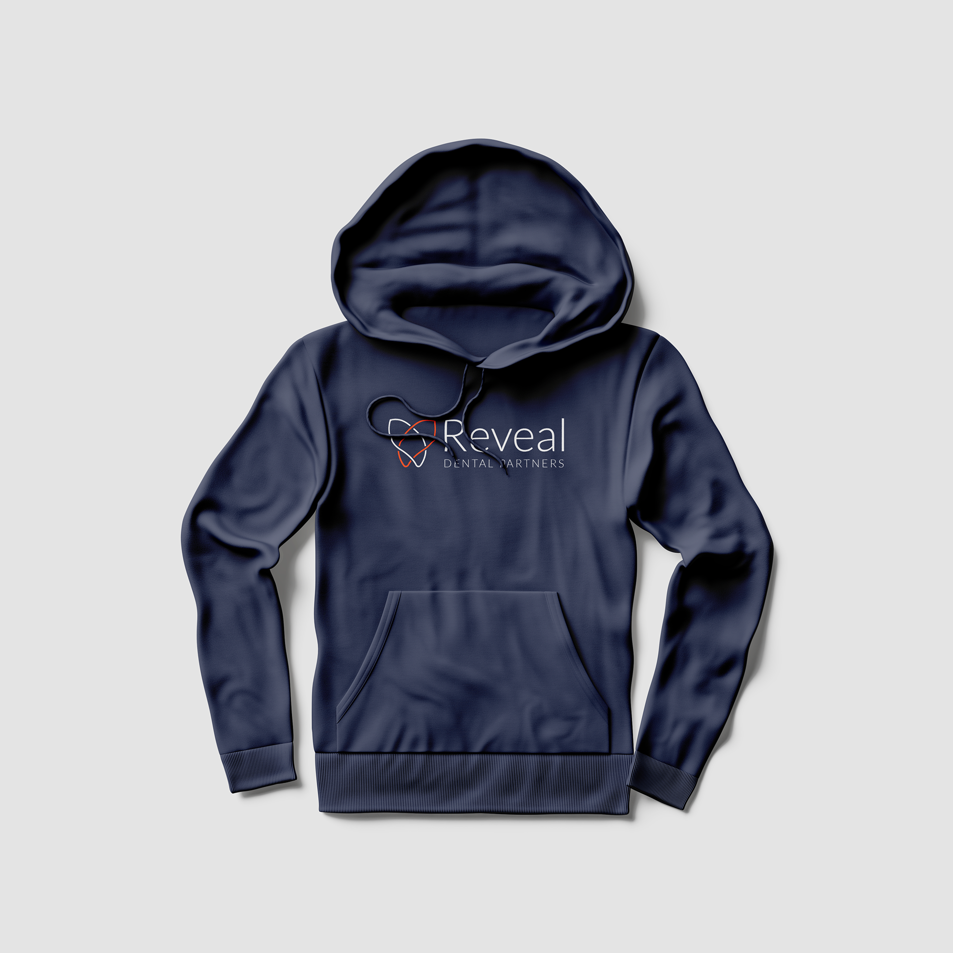
Blue Hoodie
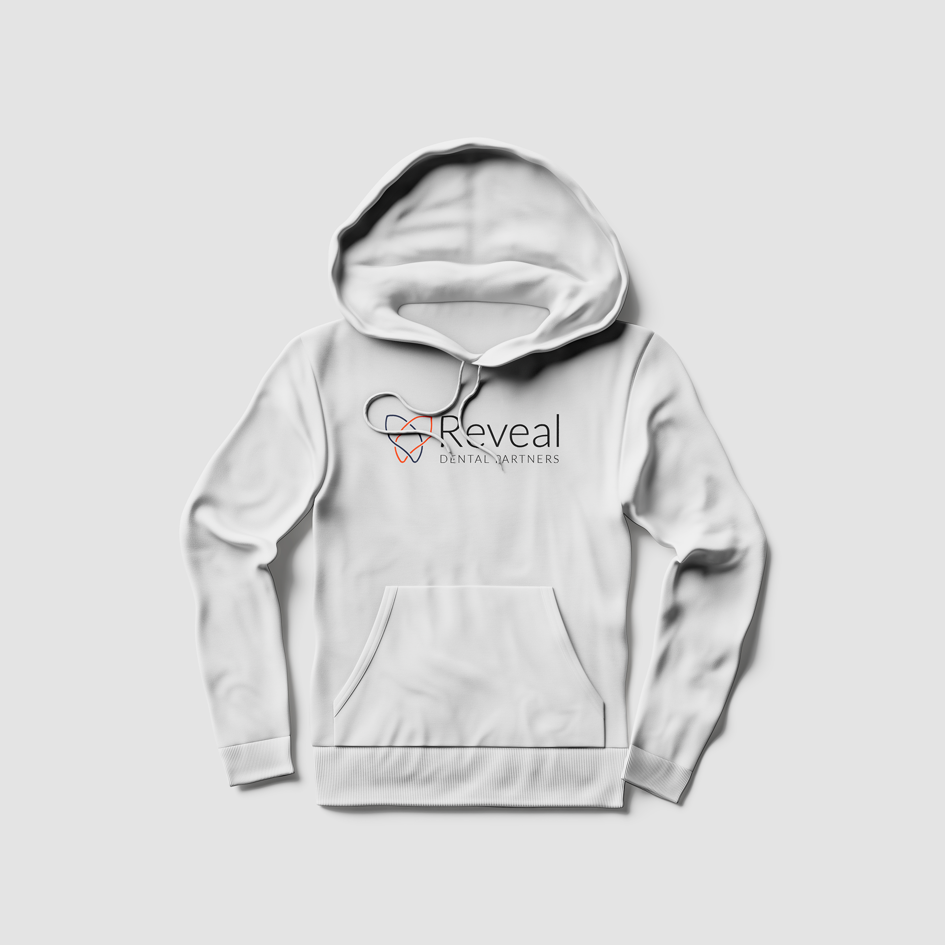
White Hoodie
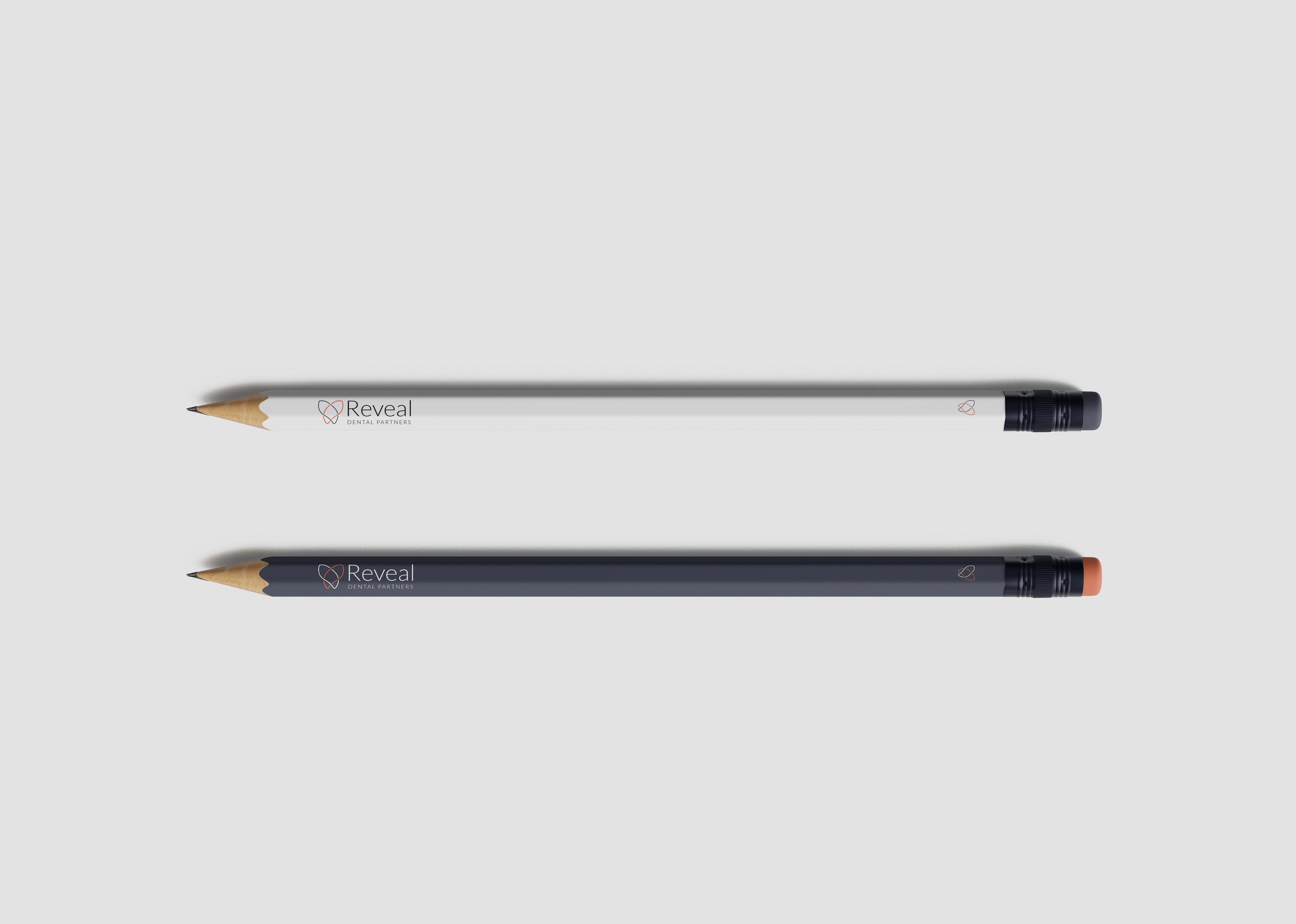
Pencils

Sticker
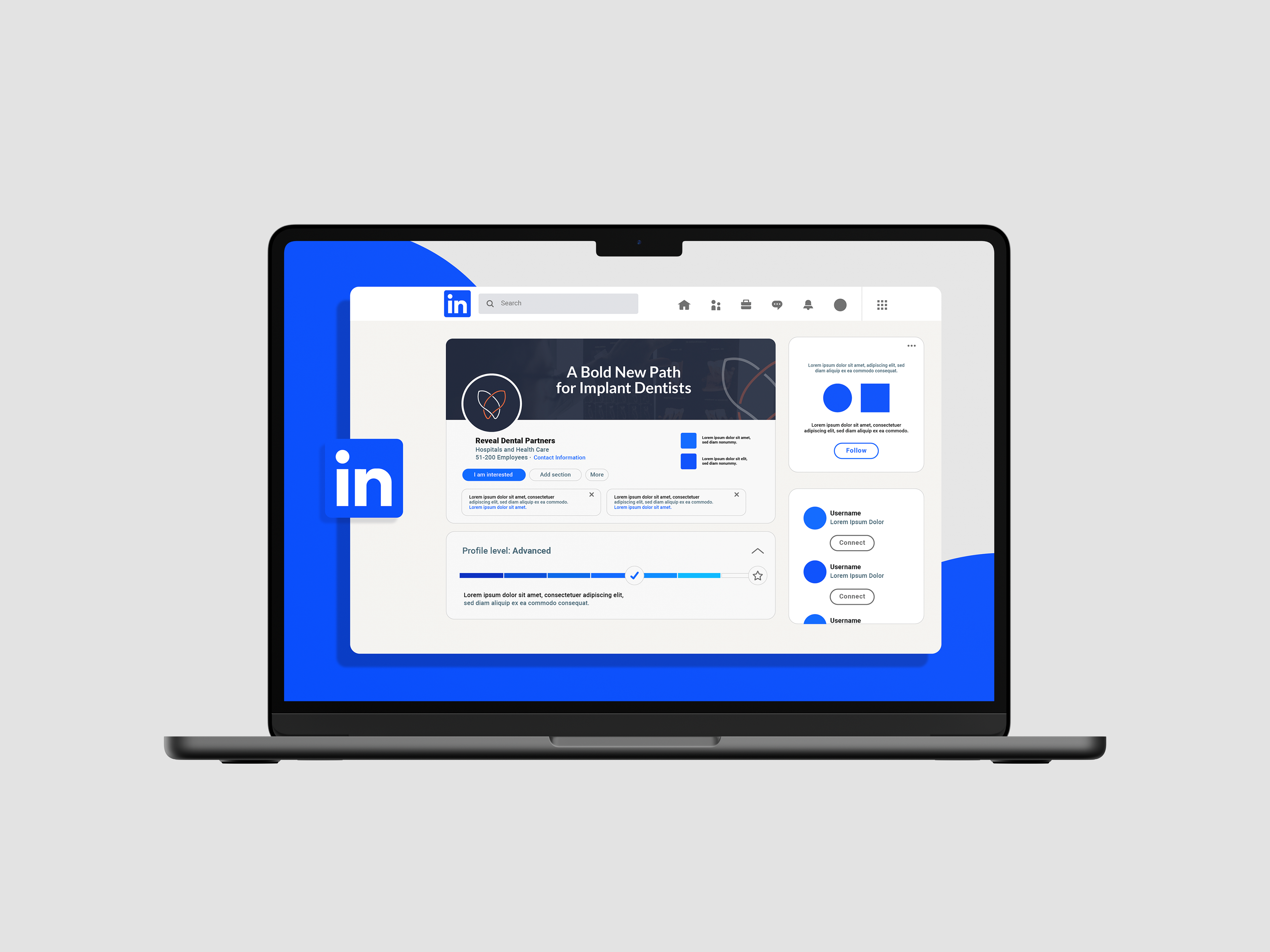
LinkedIn Avatar & Cover